Infographics have become a powerful tool for visually presenting information in an engaging and easily digestible format. In this article, we’ll explore some of the best infographic examples that can serve as inspiration for your next design project. From data-driven visuals to storytelling graphics, these examples showcase the versatility and creativity of infographics.
1. Data-Driven Infographics
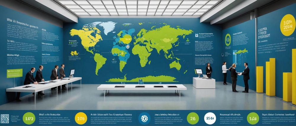
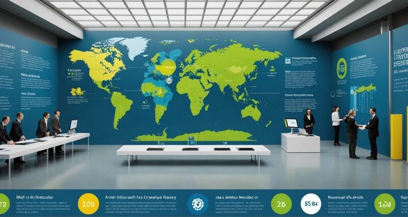
Data-driven infographics are ideal for presenting statistical information, trends, or survey results. They leverage charts, graphs, and diagrams to make complex data more comprehensible. A compelling example is the “World Population Growth” infographic, which uses layered bar charts and color-coded maps to illustrate population changes over time. By breaking down data into visual elements, these infographics enable viewers to quickly grasp key insights.
When designing a data-driven infographic, it’s essential to:
- Use clear and accurate data sources.
- Apply consistent color schemes for easier differentiation.
- Include legends and labels to enhance readability.
2. Timeline Infographics
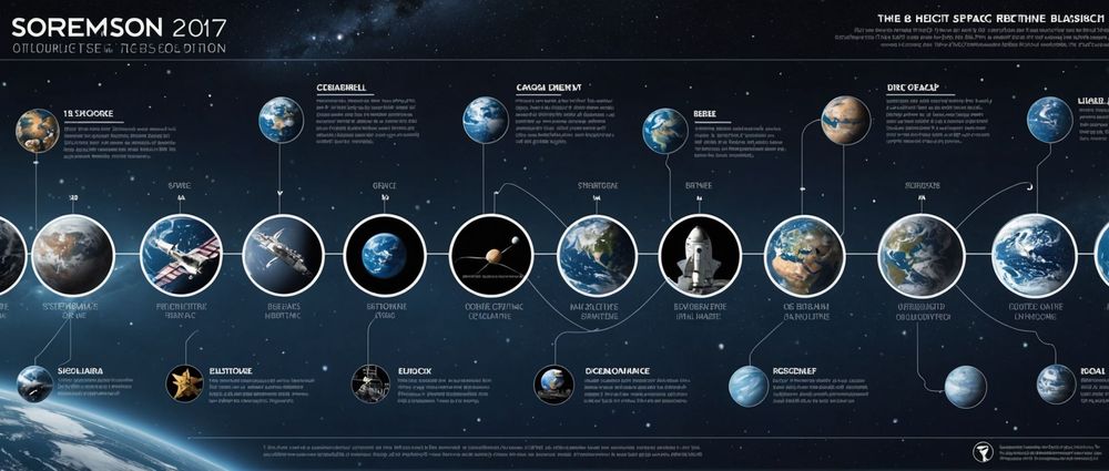
Timeline infographics effectively narrate a sequence of events or the evolution of a particular subject over time. They are perfect for historical overviews, project milestones, or product development stages. The “History of Space Exploration” infographic is a perfect example, detailing key missions and milestones from the 20th century to the present day. This visual approach helps in making chronological content engaging and easily navigable.
Key elements to include when creating a timeline infographic:
- Clearly defined time intervals.
- Visual markers for significant events.
- Supporting images and icons for context.
3. Comparison Infographics

Comparison infographics are used to juxtapose two or more items for direct comparison. These can range from product features, pricing plans, to different processes. For instance, the “Electric Cars vs. Gasoline Cars” infographic compares the environmental impact, cost, and efficiency of both vehicle types through side-by-side visuals. This format aids users in making informed decisions by presenting the pros and cons clearly.
While designing a comparison infographic, consider the following tips:
- Opt for a clear layout that divides sections distinctly.
- Use icons or illustrations to represent comparative metrics.
- Highlight key differences with contrasting colors.
4. Informational Infographics
Informational infographics communicate a specific message or educate the audience on a topic. They often combine text, icons, and images to convey information collaboratively. A notable example is the “Guide to Recycling” infographic, which explains the recycling process and tips for effective waste management. Informational infographics are excellent for simplifying complex subjects and presenting them in a user-friendly manner.
Components of a successful informational infographic include:
- Concise and informative text.
- Relevant imagery and icons.
- Clear headings and subheadings for easy navigation.
5. Process Infographics
Process infographics delineate step-by-step procedures, making it easy for viewers to follow and understand processes. This type is ideal for tutorials, workflows, or system overviews. The “How to Brew Coffee” infographic illustrates each step in the coffee brewing process with accompanying images and brief descriptions. This visual guide ensures even complex procedures are straightforward and comprehensible.
When crafting a process infographic, ensure to:
- Break down the process into clear, manageable steps.
- Use visuals to complement each step.
- Maintain a logical sequence from start to finish.
Conclusion
Infographics remain a versatile and impactful medium for conveying information visually. Whether you’re aiming to present data, timelines, comparisons, informational guides, or processes, the right design can significantly enhance your message’s clarity and engagement. Drawing inspiration from the highlighted examples can help you create infographics that are not only informative but also visually captivating.
FAQ
1. What is the main purpose of an infographic?
The primary purpose of an infographic is to present complex information in a visual and easily digestible format to improve comprehension and retention.
2. How can I ensure my infographic is effective?
An effective infographic should have clear objectives, use accurate data, and incorporate visually appealing designs that enhance understanding.
3. What tools can I use to create infographics?
Several tools are available for creating infographics, including Canva, Piktochart, Adobe Illustrator, and Infogram.
4. What types of content are best suited for infographics?
Infographics are best suited for content that benefits from visual representation, such as statistical data, timelines, comparisons, processes, and informational guides.
5. How can I make my infographic stand out?
To make your infographic stand out, use a unique design style, integrate high-quality visuals, keep the information concise, and ensure it’s relevant to your audience.